A Blueprint for Resilience
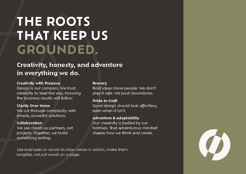
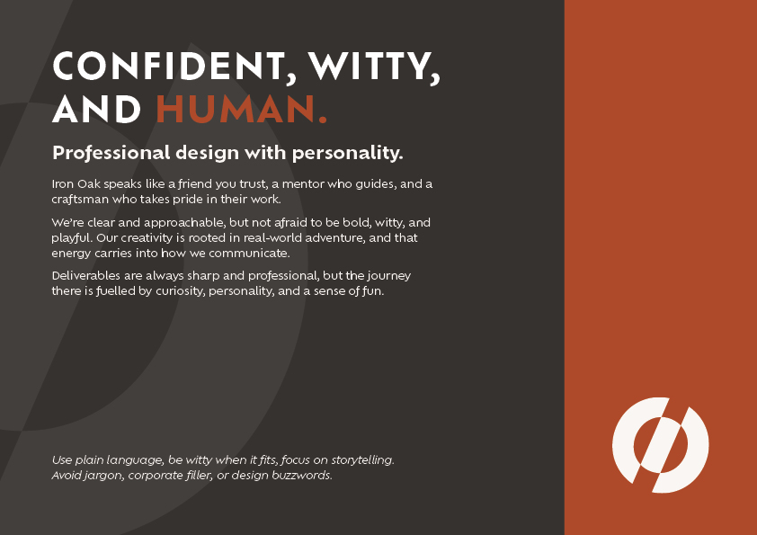
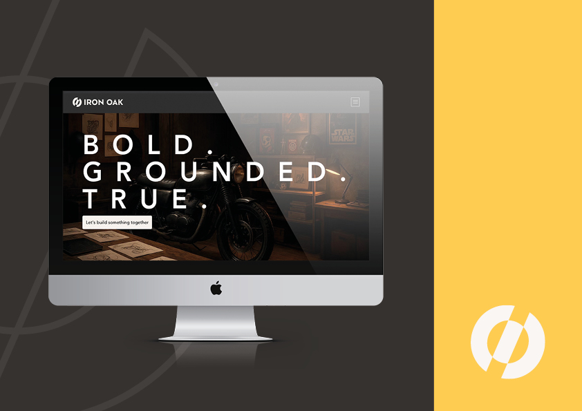
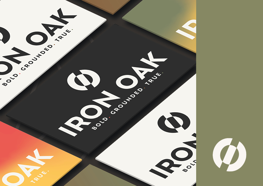
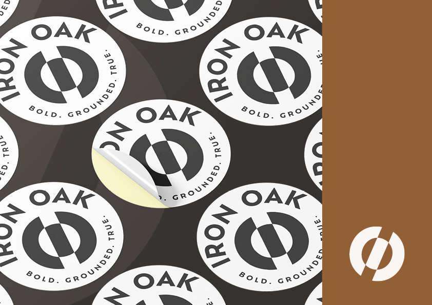
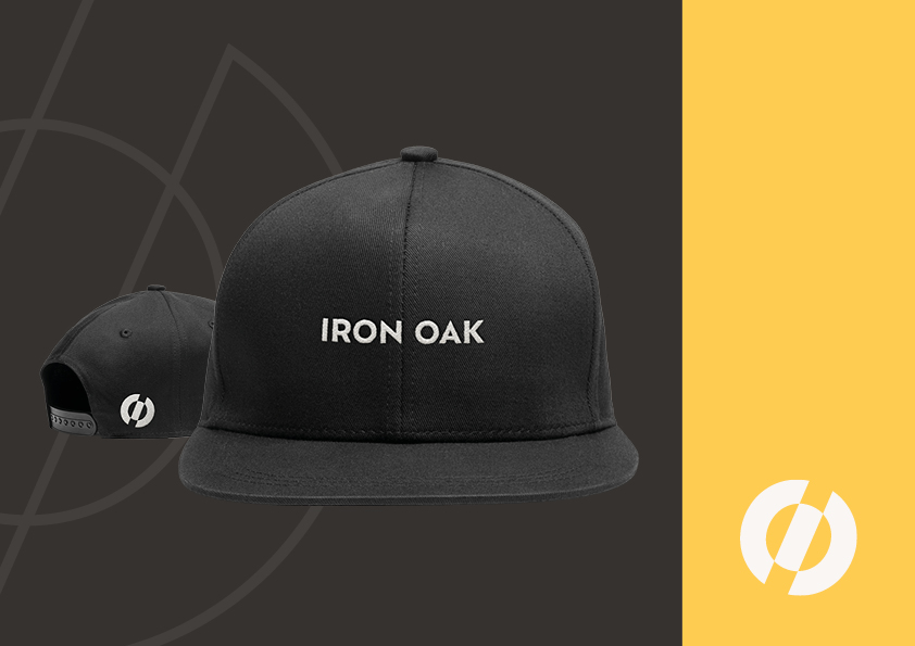
Iron Oak is more than a creative alias; it is a strategic sandbox where design leads and business follows. These guidelines serve as the operating system for the studio, defining a visual identity built on the values of “Bold. Grounded. True.”
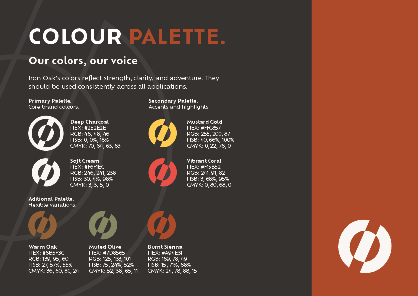
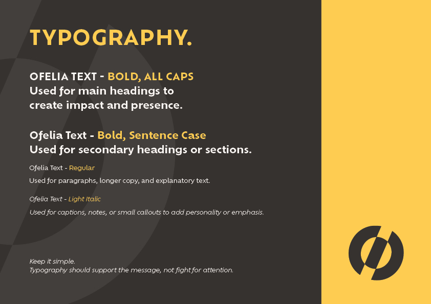
Drawing on the discipline required for rock climbing and the durability of nature, this document demonstrates how to build a brand that resists “visual drift.” From the safety-inspired Vibrant Coral accents to the rigorous typographic hierarchy, these guidelines prove that creativity thrives best when it has a strong foundation.